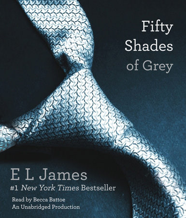
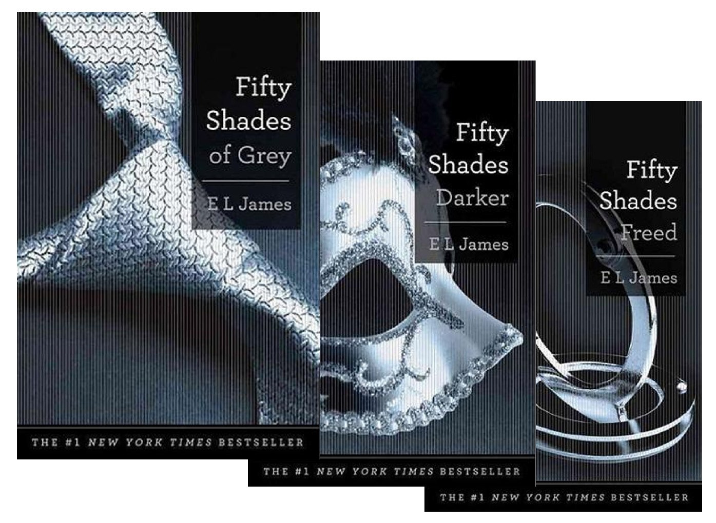
Using photoshop I designed the covers for the original publication of the Fifty Shades of Grey Trilogy from The Writer's Coffee Shop. The project included designing bookmarks for each title.
Creating the cover designs for the Fifty Shades Trilogy was a challenging experience. I was still relatively new to cover design and worked closely with the author to ensure her vision was fulfilled while creating a cohesive design throughout each book.
The author wanted covers that would not draw negative attention to the reader in public. Too many erotica titles had men and women in various states of undress in compromising positions and felt many people were embarrassed to read these books in public. She wanted a central icon that fully represented each book. The resulting designs fulfilled the author's vision and made it easy for the reader to mask the subject of the book until the trilogy became a phenomenon and everyone knew exactly what the books were.
Fifty Shades of Grey set the standard for the trilogy. The background from the original stock image was extracted and used for the background for the other two books. The author wanted a clean, crisp font that would be easy to read, yet something different from the standard fonts. The final choice was American Typewriter. The split title allowed for the continuity of the trilogy title Fifty Shades and then the distinction under this with the book title - of Grey, Darker, and Freed.
The background from the original photos for Fifty Shades Darker and Fifty Shades Freed had to be removed in order to keep the Fifty Shades background. This was challenging for the mask photo because of the feather. The feather required some manipulation to get the look right.

Fifty Shades of Grey front cover
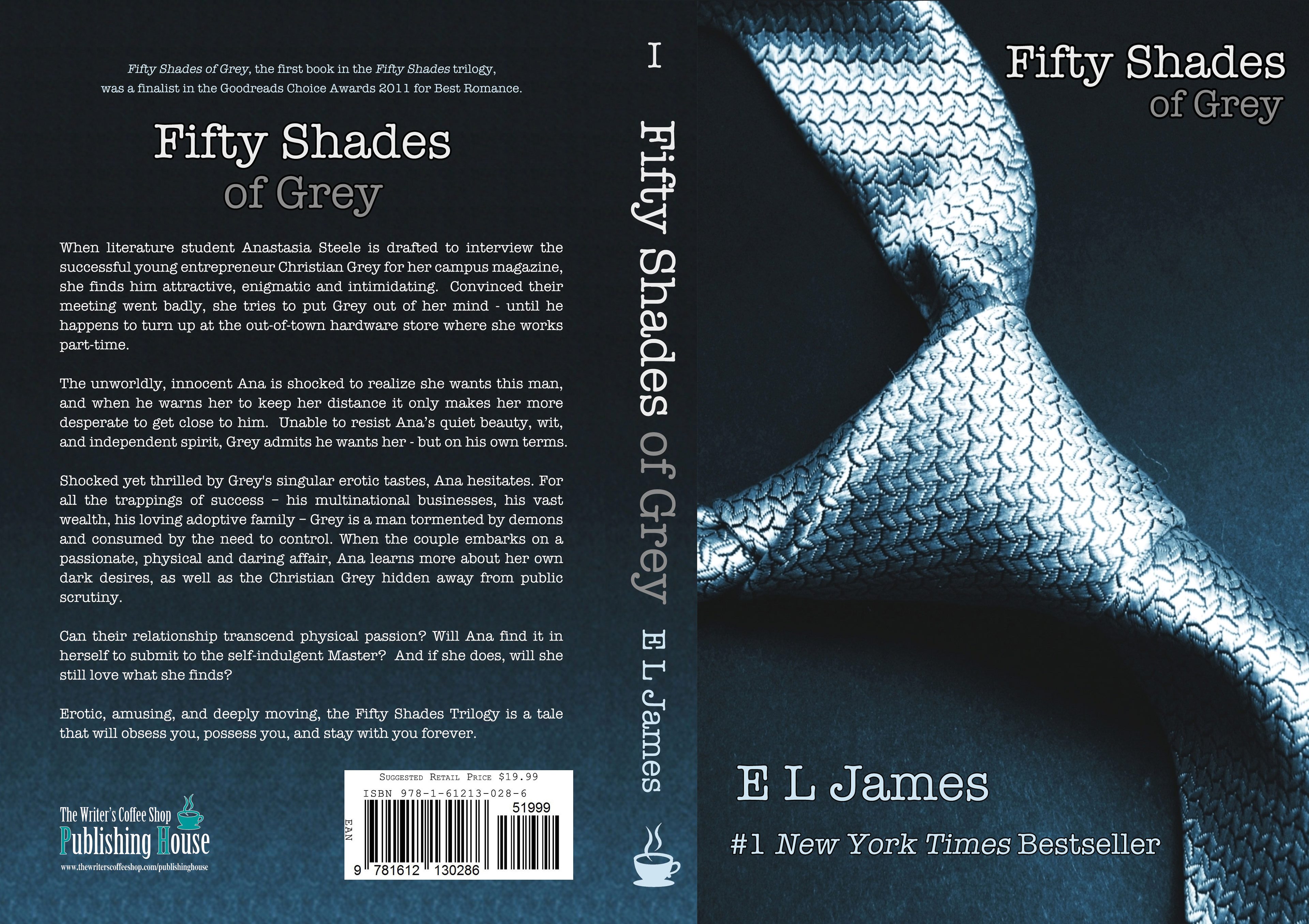
Fifty Shades of Grey full cover

Front book mark for Fifty Shades of Grey

Back book mark for Fifty Shades of Grey
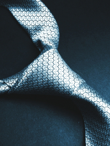
Original stock photo for Fifty Shades of Grey

Fifty Shades Darker front cover

Fifty Shades Darker full cover

Front book mark for Fifty Shades Darker

Back book mark for Fifty Shades Darker
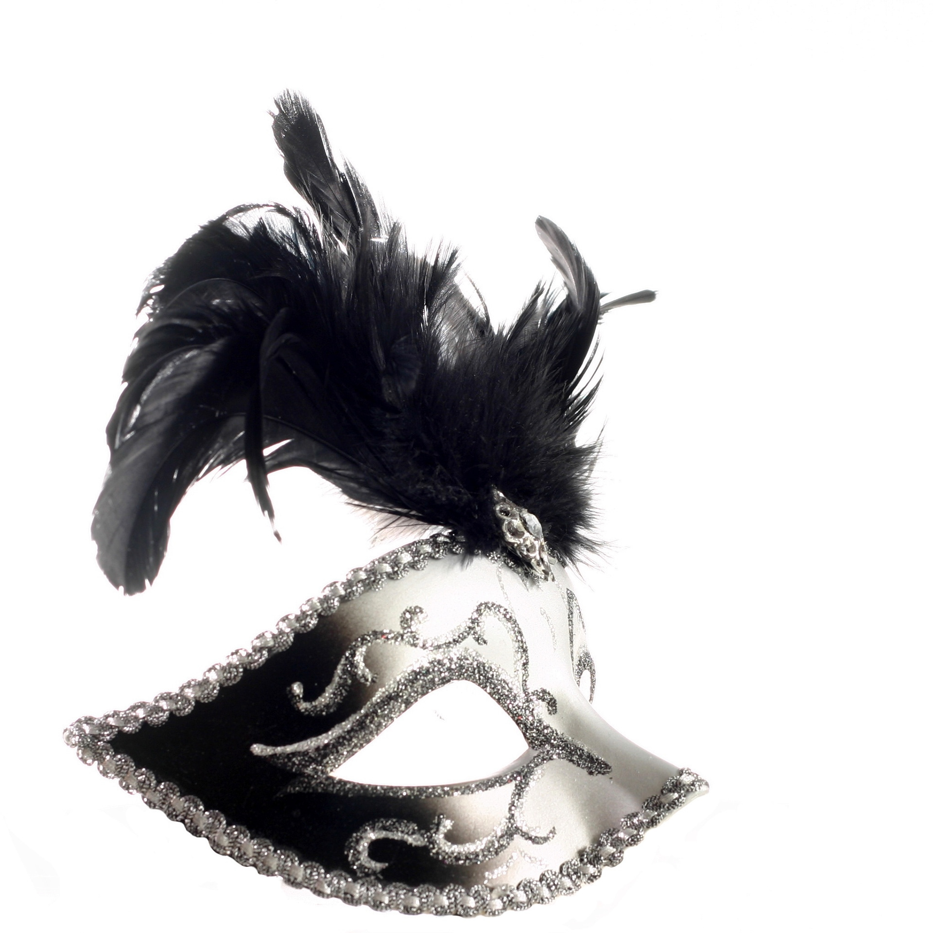
Original stock photo for Fifty Shades Darker

Fifty Shades Freed front cover
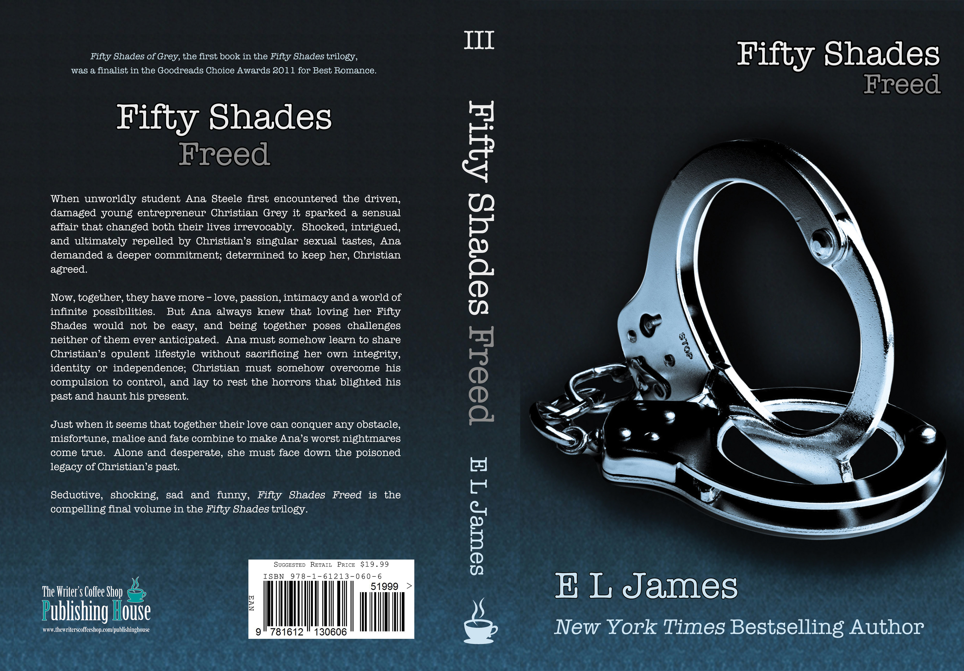
Fifty Shades Freed full cover

Front book mark for Fifty Shades Freed

Back book mark for Fifty Shades Freed

Original stock photo for Fifty Shades Freed

Promotional image for the Fifty Shades trilogy

Promotional image for the Fifty Shades trilogy
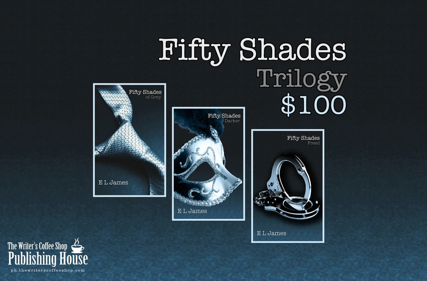
Promotional image for the Fifty Shades trilogy
The designs were used as a basis for the republication from Random House which are pictured below.
